If your Instagram app suddenly looks a little different at the top, you’re not imagining things. On August 13, 2026, Instagram rolled out its first wordmark redesign in a decade, and the reaction has been… let’s say “spirited.”
What Actually Changed
Before you panic-check your home screen: the beloved gradient camera icon — pink, purple, orange, the one sitting on billions of phones — is completely untouched. What changed is the wordmark, the cursive-style text logo that appears at the top of the app when you open it.
Instagram head Adam Mosseri announced the update himself on both Instagram and Threads, explaining that the wordmark hadn’t been touched in ten years and was overdue for a refresh. He described the new design as “sharper and more modern” while still nodding to the original typeface and the simplicity that’s defined the brand since the beginning.
The new lettering sits in an odd in-between space — not quite cursive, not quite print. The strokes are smoother, the shape more compact, and several letters (particularly the “s,” “g,” and “r”) now carry distinctive new curves.
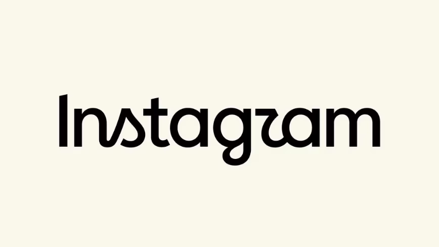
“Instagzam”
Here’s where things got messy. That redesigned “r” doesn’t read cleanly to a lot of people — and the internet noticed almost immediately.
Within hours, the top comment under Mosseri’s announcement was some version of: does this say “Instagzam”? The joke spread fast. Some read the “s” as an “a.” Others said the whole thing looked like a toddler trying to sound out “Instagram” — cue jokes about “Instagwam” and “Instaguam.”
Even outlets that generally cover tech with a straight face couldn’t resist. One headline flatly called the new look “hard to read.” Social media consultants weighed in with mixed verdicts, and the general consensus settled somewhere between “fine, I guess” and “why did they touch this at all.”
Why Rebrand a Logo Everyone Already Recognizes?
It’s a fair question. Instagram isn’t exactly hurting for brand recognition — the platform passed 3 billion monthly active users in late 2025, up from 2 billion just a few years earlier. When your name is that deeply embedded in culture, tweaking even a small piece of your visual identity is going to get noticed, for better or worse.
But that’s arguably the whole point. A wordmark seen every single day by billions of people tends to fade into the background — it becomes furniture. Change a few curves, and suddenly people are actually looking at it again, tracing the letters, arguing about what it spells. Love it or hate it, “cleaner and more modern” got people talking about Instagram’s branding in a way that hasn’t happened in years.
It’s also worth noting the timing. Instagram in 2026 barely resembles the photo-sharing app it started as — it’s now a hub for Reels, messaging, shopping, and algorithmic recommendations. The company chose to refresh only the least functionally important part of its identity: a logotype that shows up in headers and marketing materials, not the actual app experience millions of people use every day.
The Bigger Picture
This isn’t Instagram’s first brand shake-up, and it’s nowhere near as dramatic as its last one. Back in 2016, Instagram ditched its retro brown camera icon and rainbow stripe entirely, replacing them with the flat gradient icon we still see today. That change signaled a real transformation — from a niche photo-filter app into the sprawling media platform Instagram was becoming.
This time, the shift is far more subtle: new typography, same icon, same app, same billions of users. But subtle doesn’t mean unnoticed. If anything, the “Instagzam” saga proves that even the smallest brand tweaks can spark outsized reactions when your audience is measured in the billions.

Whether Instagram tweaks the wordmark again in response to the backlash remains to be seen. For now, one thing’s for sure — everyone’s suddenly paying very close attention to how the word “Instagram” is spelled.
Currently, the redesign appears to be rolling out gradually, so you may not see the new wordmark in your app just yet.
Also Read : Google search console new update